Collections

All
4776 deviations
Featured
1804 deviations
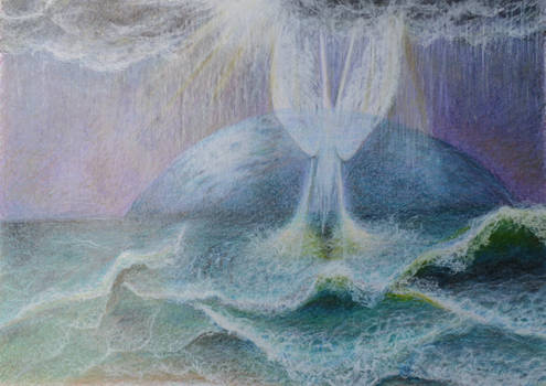
Balance in a composition - weight
When I finished my recent painting "Invisible Source", it was ok, but still it didn't feel complete or satisfying to me, although I had made it according to the sketch. The reason was the lack of balance in the work. So here will be a small journal about the balance in the artworks with the examples, how I messed up my work and where was the solution. Each element in our works has its mass or weight - more the element weighs, more our attention gravitates around it. The weight is created by intensity of characteristics - we have amount of details, size of elements, contrast, saturation, brightness etc. It becomes tricky when the elements in our works have the more noticeable weight of different characteristics, for instance, one element we have in a bright colour, but the other element has a lot of details to it. Then a question arises - how to make the work to look harmonic and balanced? When it comes to the balance I would imagine the central/the balance point of the sheet of paper
AMAZING and UNIQUE
3012 deviations